How I built a Digital Journal app to digitize kids' Artworks
and learned so much from trying new technology 🧰!
Table of contents
- Inspiration
- How My-art-journal was built.
- Tech Stack
- Building it
- Setting up frontend for UI build:
- Setting up User Authorization and Identification:
- Build SVG icons ❄🌟:
- Building a component for User Authorization 🛡
- Register Netlify Identity url for the app and call login function from <AuthUser /> component
- 🤦♂️ As I was coding along, I hit a snag 🚳 ❗❗
- Building <Home /> 🏠 component
- Building <Arts/> component
- Build with Sanity.io
- Setting up Sanity:
- Setting up Art schema
- Setting up User schema
- Setting up PostedBy schema
- Setting up comment and save schemas
- At this point, Sanity is ready to store and manage all assets sent from frontend. Connecting Sanity with React and Building components for uploading and fetching are the next challenges 🧩
- Connect Sanity with React frontend
- Setting up Sanity Client and Image-Url builder at frontend
- Setting up Sanity Queries
- Save the logged in user detail into Sanity
- Build <CreateArt />🖌 component for uploading Art to Sanity
- Build <Art /> 🎭 component
- Build <MasonryLayout/>📱component
- Build <Feed /> 🔭component
- Build <ArtDetail/> 🖼 component
- Build <Search/> 🔎 component
- Build <SideBar/> 🗄 component
- Build <UserProfile/> 👩💻 component
- Deploy the App with Netlify
- UI upgrade
- Try it out
Inspiration
Art generates love of learning and creativity. Kids love creating art by painting, drawing and crafting. This app was built to capture all those adroitness and create great memories for years to come!
So, before throwing away the art papers, take some photos, turn them into digital art to share, celebrate and keep the creativity on ✨
How My-art-journal was built.
Tech Stack
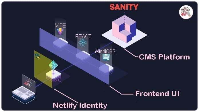
📟Frontend:
- VITE is a superfast frontend tool to render React.
👥User Authorization
- Netlify Identity: Manage and authenticate users on your site or app, without requiring them to be users of Netlify or any other service.
🎨Styling:
- WindiCSS: fully integrated with VITE to bring faster load times and Tailwind compatibility.
🧱Backend:
- Sanity: A futuristic CMS platform for building data driven application.
📡Deployment:
- Netlify Build: A modern CI/CD infrastructure for frontend deployment, pre-configured and fully automated. Just connect your Code repo then push🚀.
Building it
Setting up frontend for UI build:
With VITE, initiating a development environment for React is as easy as 4 commands:
npm init vite@latest myartjournal -- --template react
cd myartjournal
npm install
npm run dev
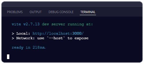
Those lines fired up a scaffolded React App with a Vite dev server and...it's fast ⚡
Integrated WindiCSS into VITE:
- Install the package:
npm i -D vite-plugin-windicss windicss - Then, install the plugin in the Vite configuration:
vite.config.js
import { defineConfig } from 'vite';
import react from '@vitejs/plugin-react';
import WindiCSS from 'vite-plugin-windicss';
// https://vitejs.dev/config/
export default defineConfig({
  plugins: [react(), WindiCSS()]
})
- And finally,
import virtual:windi.cssin the Vite entries which ismain.js
Setting up User Authorization and Identification:
I've tried other different tools so for this app, I decided to learn a new tech by diving into Netlify Identity.
There are several good documentations for using Netlify Identity in various tech stacks, but the challenge for this app is some child components need to access {Signed in user} object to render avatar, id and link them to {fetched assets} from CMS.
A solution for that was injecting the useContext hook from React and a context Provider to wrap around the <App /> component.
Below is the walk-through⌨:
- Set up Netlify Identity in the app: This actually is a very simple step. All I needed to do was login to my Netlify ➡ deploy by connect to my repo on Github
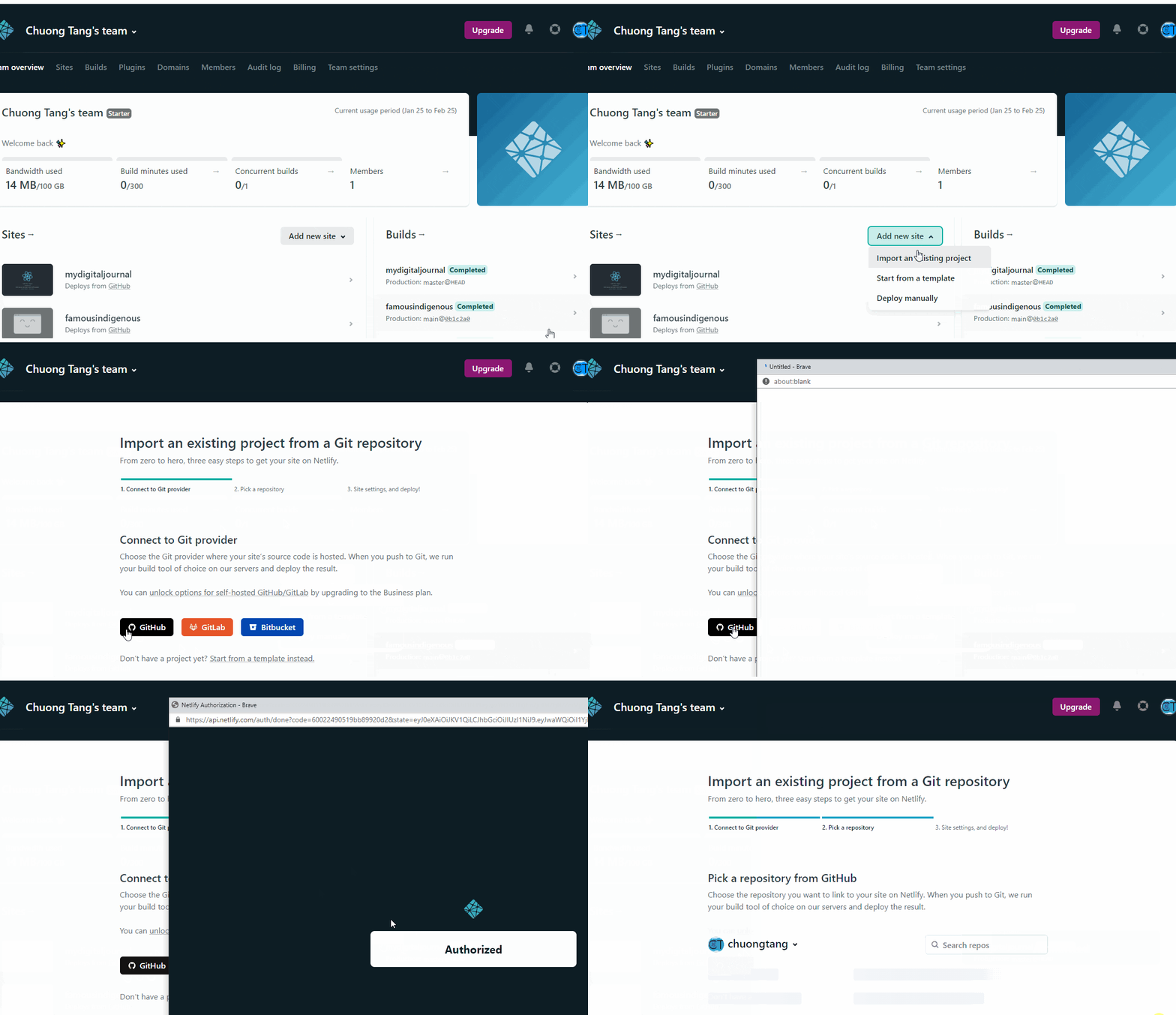 then ➡ navigate to my site setting ➡ go to
 Identitytab ➡ clickEnable Identity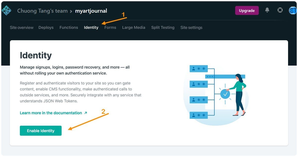
At the frontend root: install netlify-identity-widget by running the command:
npm i netlify-identity-widget.👓Check out the this well written docs from Authenticate users with Netlify IdentityCreate a folder named
"store"in my frontendrootand a new component calledAppContext.jsxIn the
AppContextcomponent:import netlifyIdentity from 'netlify-identity-widget';with this I can access to all the methods ("init", "open", "close", "on", "off") from Netlify Identity. Each method corresponds to a callback function and they are well documented in the docs.Create a "global" context with initial props using
createContextfrom react// create global context export const AppContext = createContext({ user: null, login: () => { }, logout: () => { }, authReady: false })- Create a Context Provider to wrap around the app component:
export const AppContextProvider = ({ children }) => {
const [user, setUser] = useState(null);
const [authReady, setAuthReady] = useState(false);
useEffect(() => {
//Calling all functions from *Netlify Identity* methods as mentioned above..
}, []);
Create a
context objectto feed into Provider then return a wrapper component:const context = { user, login, logout, authReady,} return ( <AppContext.Provider value={context}> {children} </AppContext.Provider> )
Build SVG icons ❄🌟:
The reason why I didn't use any icon font libraries (such as, Fontawesome, Ionicons, MUI-icons...) is because they are browser dependent! Icons can replace entire sentences and show an action in one single glance (e.g. the Home button🏚). A big problem with icon fonts is when they don’t display correctly. Browsers won’t be able to interpret them and end up displaying nothing or empty characters that don’t support the content at all.
So..., I built them all from scratch, using jsx syntax. With that, I can even pass props into my icons to render (size, color...) and add tooltip without any extra blocks.
I created an assets folder in src for all my jsx-Icons. Each icon component has props to pass along and only return a SVG tag.
Here is the example of the <AppLogo />⬇
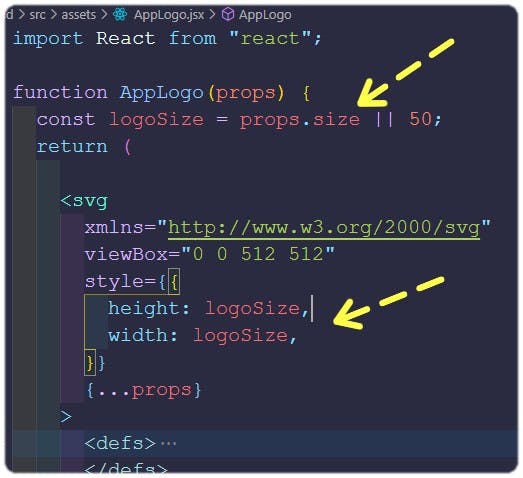 Render different size Logos for 2 different components:
 For tooltip on the icon, it's the
 <title> inside the <svg> that got rendered
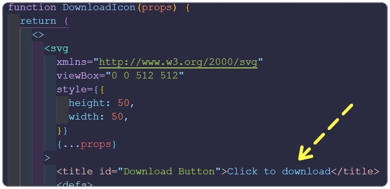
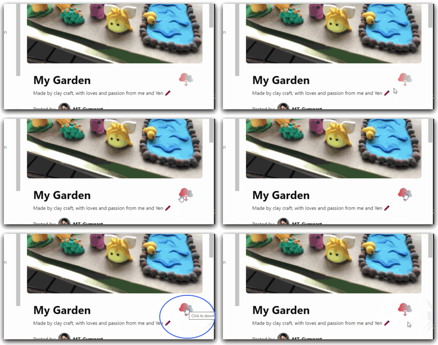
Building a component for User Authorization 🛡
With my AppContext up and running, building a login component using Netlify Identity becomes simple.
- In my
src, I created a folder namedcomponentsand a newAuthUser.jsxinside that folder. - In the
AuthUser.jsx, de-structure the{login}object from AppContext. - Built a "login" button with WindiCSS utility classes.
- Set the button onClick to
{login}function . Here is how it looks:
import React, { useEffect, useState } from 'react';
import { useContext } from 'react';
import AppContext from '../../store/AppContext';

const AuthUser = () => {

  const { user, login } = useContext(AppContext)
return (
    <div className="flex justify-start items-center flex-col h-screen ">
        <div className="absolute flex flex-col justify-center items-center top-0 right-0 left-0 bottom-0 bg-blackOverlay">
          <div className="p-5">
            <AppLogo size={250} />
          </div>
          <div className="shadow-2xl ">
            <button type="button" className="py-2 px-4  bg-gray-500/50 hover:bg-indigo-700 focus:ring-indigo-500 focus:ring-offset-indigo-200 text-white w-full transition ease-in duration-200 font-semibold shadow-md focus:outline-none focus:ring-2 focus:ring-offset-2  rounded-lg " onClick={login}>
              LOGIN
              <LoginIcon />
            </button>
          </div>
        </div>
    </div>
  );
};
export default AuthUser;
- When login is successful, the
{user}object is valid and<Home/>component is rendered following the the logic set inApp.jsx
import React from 'react'
import './App.css'
import { useContext } from 'react';
import AppContext from '../store/AppContext';
import AuthUser from './components/AuthUser';
import Home from './container/Home';
const App = () => {
  const { user } = useContext(AppContext)
  return (
    user == null ? <AuthUser /> : <Home />
  )
}
export default App;
Register Netlify Identity url for the app and call login function from <AuthUser /> component
- Login to the Nelify then select the
sitethat deployed for this project - Copy the
API endpointin the Identity tab
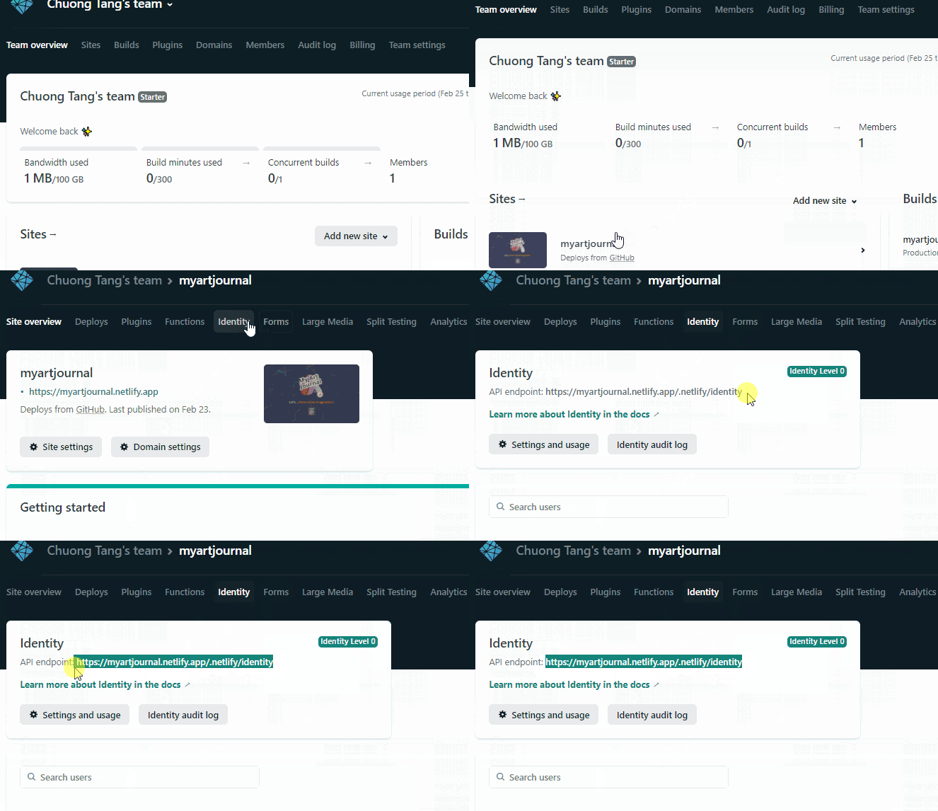
- At the frontend root, run
npm run dev.
- Open
http://localhost:3000/in a web browser and click the login button - Paste the
API endpointto the URL field then clickset site URL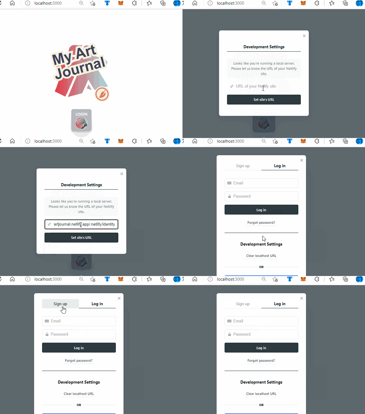
. . .
🤦♂️ As I was coding along, I hit a snag 🚳 ❗❗
Netlify Identity can be integrated with GoogleAuth, and others services (github, git bucket...) but the user-JSON returned from Netlify Identity does not contain an avatar url 😩, only user's fullname!
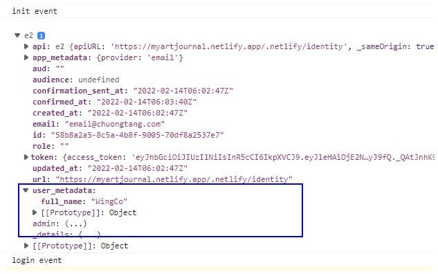 My workaround was to build a user-image avatar base on the full-name pulled from Netlify Identity user_metadata.
Quite lengthy in bytes but logically, it's effective ✔
so, right in my store/AppContext.jsx, ⬇
// Convert fullname to initial
  const Initial = user?.user_metadata.full_name?.substring(0, 2); //use first2 letters only

  // ⇩ Random colors for  svg background
  const randomColor = `'%23${Math.random().toString(16).slice(2, 8).padEnd(6, '0')}'`;

  // Create SVG avatar with initial
  const ImgURLstring = `data:image/svg+xml,%3Csvg xmlns='http://www.w3.org/2000/svg' viewBox='0 0 512 512' style='height:512px%3Bwidth:512px'%3E%3Cpath d='M256 23.05C127.5 23.05 23.05 127.5 23.05 256S127.5 488.9 256 488.9 488.9 384.5 488.9 256 384.5 23.05 256 23.05z' fill=${randomColor}/%3E%3Cg font-family='Arial  Helvetica  sans-serif' font-size='120' font-weight='bold' text-anchor='middle' text-decoration='rgba(255  255  255  1)'%3E%3Ctext stroke='rgba(0  0  0  1)' stroke-width='30' transform='translate(256 300)'%3E%3Ctspan x='0' y='0'%3E${Initial}%3C/tspan%3E%3C/text%3E%3Ctext fill='rgba(255  255  255  1)' transform='translate(256 300)'%3E%3Ctspan x='0' y='0'%3E${Initial}%3C/tspan%3E%3C/text%3E%3C/g%3E%3C/svg%3E`

 // Google login has an avatar url ⬇. If login is not from Google, use ⬆ variable
  const userImgUrl = user?.user_metadata.avatar_url || ImgURLstring;
- Then, this newly created
userImgUrlis injected into context to feed the app provider
   // Create context to feed into provider             ⬇
  const context = { user, login, logout, authReady, userImgUrl};

return (
    <AppContext.Provider value={context}>
      {children}
    </AppContext.Provider>
  )
- Create an
<AvatarGenerator />component to dynamically renderuserImgUrlin the globalcontextabove:
import react, { useContext } from "react";
import AppContext from '../../store/AppContext';

function AvatarGenerator() {
  const { userImgUrl } = useContext(AppContext);
  return (
    <img
      className="rounded-full w-12 h-auto shadow-lg  border-transparent border-4"
      src={userImgUrl}
      alt="user-picNEW"
    />
  );
}

export default AvatarGenerator;
... Now, the AppContext has all the parts for building a colorful page 🌈
Building <Home /> 🏠 component
Technically, it's the primary container for the app to implement dynamic routing using React Router.
A quick Sketch:
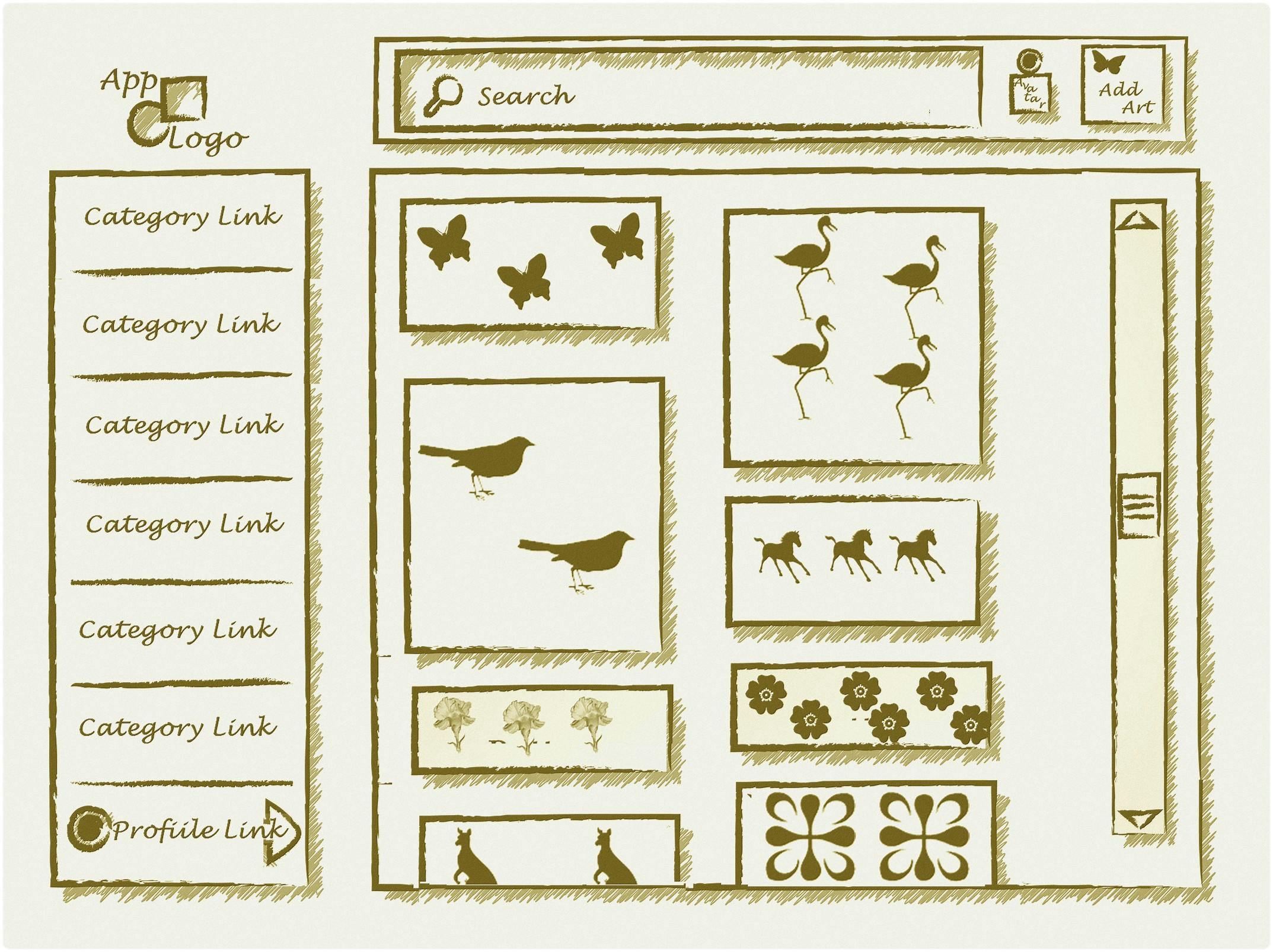
There are two main Routes to render different interfaces
User Profile: For all details connected to current user (e.g., Uploaded Art, Liked Art, Avatar, User Name.)Arts: is the parent component for the children elements that get rendered base on the path in React Routing(e.g., CreateArt, Search, ArtDetail, FeedArts..)
Below is the walk-through⌨:
- Install React Router dependencies at frontend root:
npm install react-router-dom@6 - Create a new folder named "container" and a new
Home.jsxinside. - Import
{ Link, Route, Routes }from 'react-router-dom' - Import other child components (from
./components) and SVG-Icons (from./assets) Pull the
{ user, userImgUrl }from AppContext that was built previouslyPass the
{user}prop to<Sidebar />( to be built in later steps)
Add a responsive design for small device. This will toggle between full
SideBarandHamburger Menudepending on the screen size . 👉 WindiCSS Resposive Design has great document for breakpoints, and utility classes
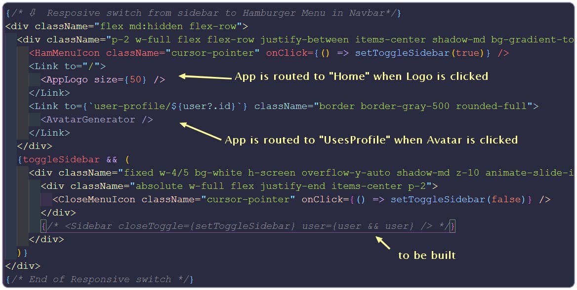
- Finally, specify the URL that corresponds to two main components:
<UserProfile/>and<Arts />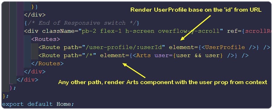
Building <Arts/> component
This is the parent component that renders children elements base on React Routing logic. It takes the {user} object from the parent (<Home/> component) then pass it to child elements (<CreateArt /> and <ArtDetail />)
- In the
containersfolder, create a newArt.jsxfile. - Import
{ useState }hook from React and{ Routes, Route }fromreact-router-dom. - Create a state variable
[searchTerm, setSearchTerm]for passing state between 'sibling' components (<NavBar/>and<Search/>)
import React, { useState } from 'react';
import { Routes, Route } from 'react-router-dom';

const Arts = ({ user }) => {
  const [searchTerm, setSearchTerm] = useState('');

  return (
    <div className="px-2 md:px-5">
      <div className="bg-gray-50">
        <Navbar searchTerm={searchTerm} setSearchTerm={setSearchTerm} user={user && user} />
      </div>
      <div className="h-full">
        <Routes>
         // These components will be built in later steps
          <Route path="/" element={<Feed />} />
          <Route path="/category/:categoryId" element={<Feed />} />
          <Route path="/art-detail/:artId" element={<ArtDetail user={user && user} />} />
          <Route path="/create-art" element={<CreateArt user={user && user} />} />
          <Route path="/search" element={<Search searchTerm={searchTerm} setSearchTerm={setSearchTerm} />} />
        </Routes>
      </div>
    </div>
  );
};

export default Arts;
Build with Sanity.io
At this point, to serve the frontend React app, it is necessary to set up database/backend on the CMS (Content Management System) :
 These are two great reference guides:
Setting up Sanity:
- To start a new project with Sanity, we'll need to install the Sanity CLI globally by running
npm install -g @sanity/cli - Exit out of the Frontend directory. Create a separate folder for Sanity (I named it
CMS)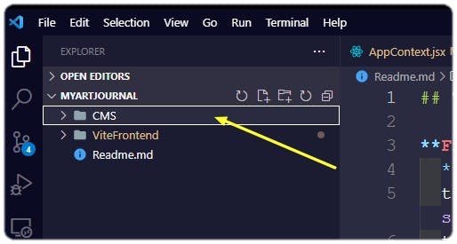
- Initiate Sanity Project inside the CMS folder by
cd CMSandsanity init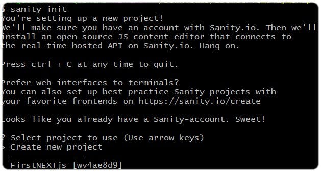
- The above command will walk you through some steps to create / login to an account, creating a project, set up the dataset, and generate files needed to run the editing environment locally.
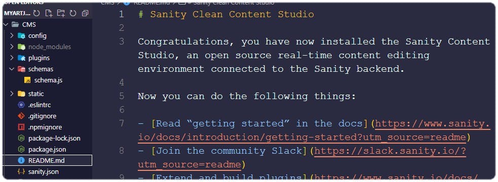
- Start the development server for Sanity Studio, by running
sanity start This builds the initial JavaScript code required to run the studio, and starts a local web server. As you modify and save the code, the server will automatically rebuild the studio and refresh the browser.
 - Open another terminal in code editor
- Create an API token and save it for frontend environment variable by running
sanity manage This will take you to Sanity login and then the project admin page.
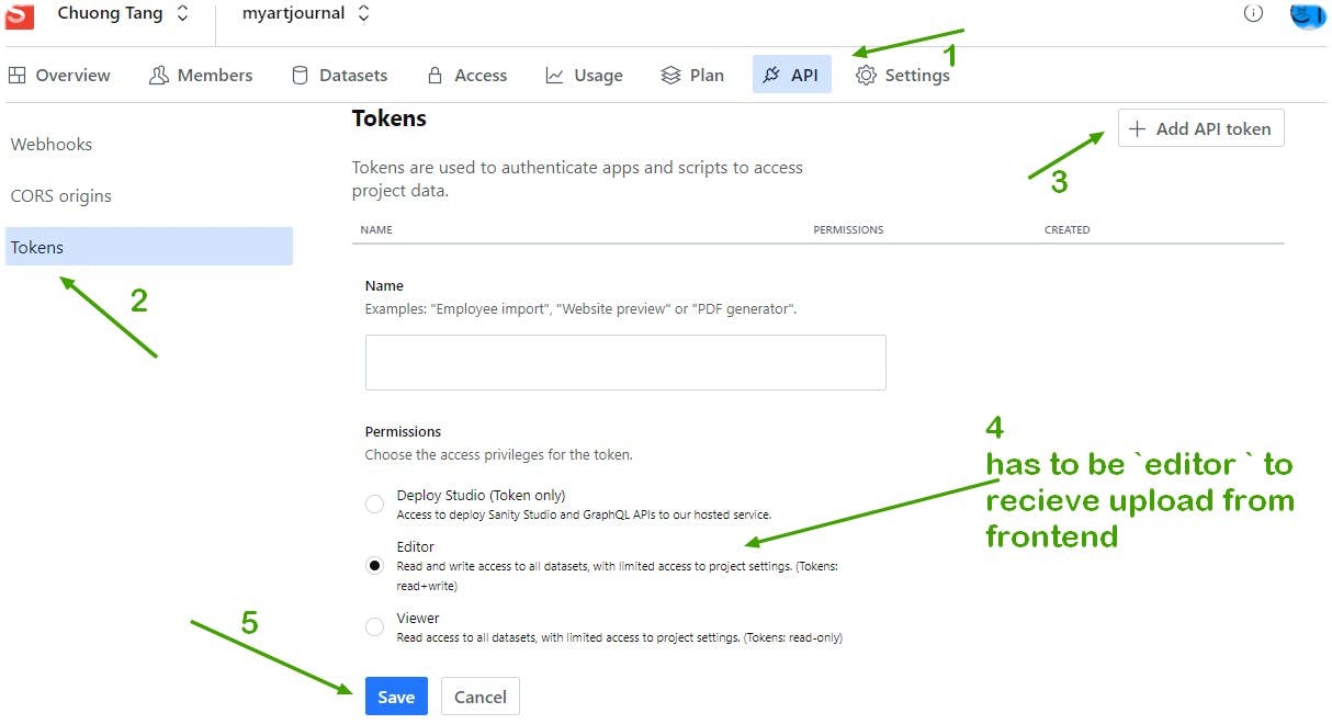 Make sure the
 tokenis saved and do NOT expose it to frontend React. It should be stored in a.envand called with aimport.metavariable.
Setting up Art schema
Every uploaded file from frontend is a piece of art and it is stored in Sanity Platform
- Create a new schema
art.jsinside theCMS/schemasfolder Define the data fields for
.art.jsexport default { name: 'art', title: 'Art', type: 'document', fields: [ { name: 'title', title: 'Title', type: 'string', }, { name: 'about', title: 'About', type: 'string', }, { name: 'category', title: 'Category', type: 'string', }, { name: 'image', title: 'Image', type: 'image', options: { hotspot: true, //⬅ set the automatic crop area in an image }, }, { name: 'userId', title: 'UserId', type: 'string', }, { name: 'postedBy', title: 'PostedBy', type: 'postedBy', }, { name: 'save', title: 'Save', type: 'array', of: [{ type: 'save' }], }, { name: 'comments', title: 'Comments', type: 'array', of: [{ type: 'comment' }], }, ], };
Setting up User schema
Even though Authentication is handled entirely at the frontend by Netlify Identity, the intent of storing users' detail is to link them with their uploaded arts, comments and number of likes.
👉Content modeling in Sanity is a great guide for schema customization.
- Create a new schema
user.jsinside theCMS/schemasfolder - Define the data fields for
.user.jsexport default { name: 'user', title: 'User', type: 'document', fields: [ { name: 'userName', title: 'UserName', type: 'string', }, { name: 'image', title: 'Image', type: 'string', }, ], };
Setting up PostedBy schema
- Create a new schema
postedBy.jsinside theCMS/schemasfolder - Define the data fields for
.postedBy.js(This schema will be linked touserto record the 'ownership')export default { name: 'postedBy', title: 'PostedBy', // ⇩ A reference is a way to point to another document which is 'user' schema type: 'reference', to: [{ type: 'user' }], };
Setting up comment and save schemas
Apply the same process above, these two schemas can be set up easily by defining correct data fields inside each file. The detail is in my Repo Here
At this point, Sanity is ready to store and manage all assets sent from frontend. Connecting Sanity with React and Building components for uploading and fetching are the next challenges 🧩
Connect Sanity with React frontend
- Login to
https://manage.sanity.io/and locateCORS originsunderAPItab - Click
➕ Add CORS originthen addhttps://localhost:3000/and Netlify deployed url
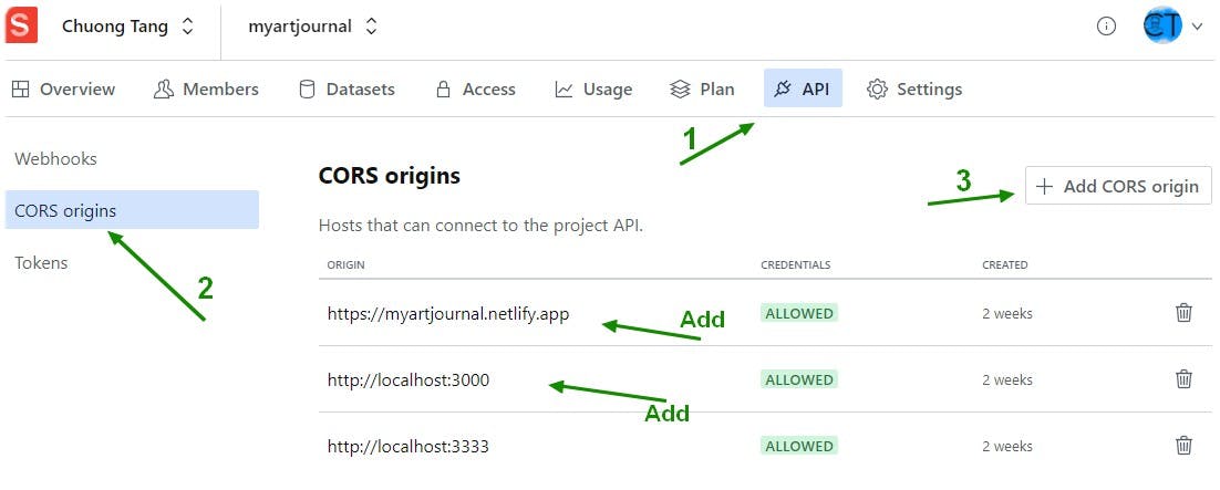
Setting up Sanity Client and Image-Url builder at frontend
A step-by-step guide can be found on 👉@sanity/client and @sanity/image-url
Back to the frontend root folder, install Sanity Client and Image-Url builder by running
npm install -g @sanity/client @sanity/image-urlInstall dotenv package to store environment variable (apiKey, Token, id...) by running
npm i dotenv- At the frontend root, create a
.envand store below important keys
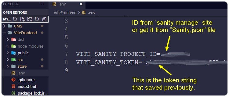
- In the
srcfolder create aclient.jsxfile following codes
import sanityClient from '@sanity/client';
import imageUrlBuilder from '@sanity/image-url';

export const client = sanityClient({
  projectId: import.meta.env.VITE_SANITY_PROJECT_ID,
  dataset: 'production',
  apiVersion: '2021-11-16',
  useCdn: false, // `false` if you want to ensure fresh data
  token: import.meta.env.VITE_SANITY_TOKEN,
});

// Quickly generate image urls from Sanity image records.
const builder = imageUrlBuilder(client);
export const urlFor = (source) => builder.image(source);
Note: the projectId and token are protected by dotenv package 🔐
At this point, React frontend can interact with Sanity by calling methods from client such as client.create(doc), client.fetch(queryName) , client.patch(doc.id) and client.delete(doc.id)..., very similar to CRUD operations for Restful API.
Setting up Sanity Queries
Sanity takes querying on JSON data one step further by introducing GROQ (Graph-Relational Object Queries), a declarative language designed to query collections of largely schema-less JSON documents. Please check out this extensive docs from Query Language (GROQ)
Under
src, create a new folder nameutilswith a newdata.jsfile in it to store all the QueriesSet up query to
create a new artfor user to upload an Artwork and recorduserIdas the art owner
export const userCreatedArtsQuery = (userId) => {
  const query = `*[ _type == 'art' && userId == '${userId}'] | order(_createdAt desc){
    image{  asset->{ url }  },
    _id,
    postedBy->{  _id,  userName,  image },
    save[]{  postedBy->{  _id,  userName,  image  }  },
  }`;
  return query;
};
- Details of other queries for
Save Art,Search Art,Delete Art,Fetch Art Detail... can be found in My Repo. - In addition to the queries, an array of
Art Categoriesobjects were added todata.jsfor rendering in the<SideBar />
Save the logged in user detail into Sanity
With the client and Queries ready to run, details from the logged in user can be saved in Sanity
- Back to the
<Home />component,import { client } from '../client'; - Get the
{user}and{userImgUrl}fromAppContext - Create
useEffectto run every time a new user is logged in
const { user, userImgUrl } = useContext(AppContext)

  useEffect(async () => {

    if (user) {
      // ⇩ create this obj to store in Sanity
      const newUserInfo = {
        _id: user.id,
        _type: 'user',
        userName: user.user_metadata.full_name,
        image: userImgUrl,
      };

      try {
        // this is a pre-set ⬇⬇ method  from Sanity client
        await client.createIfNotExists(newUserInfo);

      } catch (error) {
        console.log('error creating NewUSer', error)
      }
    };
  }, [user]);
Note: all the methods call from client are asynchronous. Therefore async...await.. should be used in conjunction with try...catch... block
Build <CreateArt />🖌 component for uploading Art to Sanity
When user click Add Art button this component is rendered. It has a file uploader📤 and an input form 📜 to enter detail about this artwork, a cancel button ⏏ to abort this uploading and a save button 💾 to confirm sending file to Sanity.
- Create a
CreateArt.jsxfile inside thecomponentsfolder - Import
useStateanduseContexthooks from React - To interact with Sanity, import
{client} - Import
{categories}fromdata.jsand related svgIconsfromassetsfor buildinginput formwhen user uploading art. - Import
{useNavigate}hook fromreact-router-dom. Once uploading is completed, the page will be routed to home to display new arts Create
uploadImagefunctionconst uploadImage = async (e) => { const selectedFile = e.target.files[0]; // uploading asset to sanity const imgTypes = ['image/png', 'image/jpeg', 'image/svg+xml', 'image/jpeg', 'image/gif', 'image/tiff', 'image/webp']; // Validate file type with above imagesType array if (imgTypes.indexOf(selectedFile.type) !== -1) { try { setWrongImageType(false); setLoading(true); let document = await client.assets .upload('image', selectedFile, { contentType: selectedFile.type, filename: selectedFile.name }); setImageAsset(document); setLoading(false); } catch (error) { console.error("error form uploading IMG", error); console.log('Upload failed:', error.message); } } else { setLoading(false); setWrongImageType(true); setTimeout( () => { setWrongImageType(false); }, 2000 ); } }File type was limited to
imageonly . Therefore, animage types arraywas set and Array.indexOf() was used to validation.- Create
saveArtfunction to save the newly uploaded art into Sanity
const saveArt = async () => {
    //  ⬇ Ensure all fields are entered for Art detail
    if (title && about && imageAsset?._id && category) {
      const doc = {
        _type: 'art',
        title,
        about,
        image: {
          _type: 'image',
          asset: {
            _type: 'reference',
            _ref: imageAsset?._id,
          },
        },
        userId: user.id,
        postedBy: {
          _type: 'postedBy',
          _ref: user.id,
        },
        category,
      };
      try {
        setLoading(true);
        //⬇ Save Art into Sanity
        await client.create(doc);
        navigate("/");
      } catch (error) {
        console.error
      }
    } else {
      setFields(true);
      // Reset fields in the input form
      setTimeout(
        () => {
          setFields(false);
        }, 2000
      );
    }
  };
- In the return body of this component, the form, input fields and uploader were built by applying WindiCSS utility classes and components (e.g., button, select, input, label...)
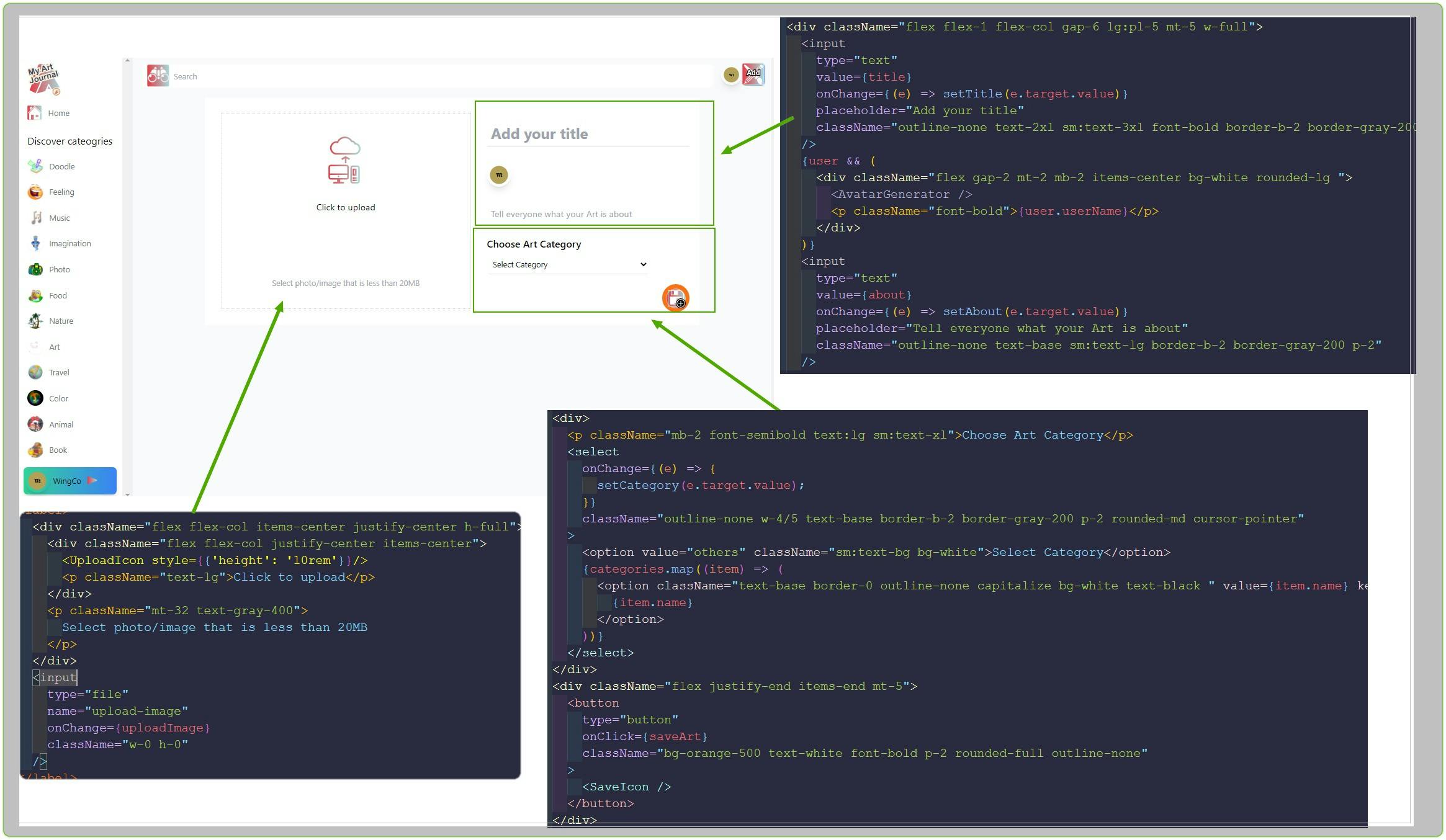 Detail in My repo
Build <Art /> 🎭 component
Each picture displayed on the page is an <Art/> component that get rendered from Sanity fetched data .
When client.fetch(queryName) is called, Sanity returns an array of art objects.
This array is then mapped to render the <Art/> component with unique id that can be passed on different functions (e.g., Save, Click Like, Delete).
Features included in this component are: Like Art, Download Art, Delete Art(if logged in as art's owner)
Below is the walk-through⌨:
- Create a new
Art.jsxfile insidecomponentsfolder - In the terminal, run
npm install uuid. This is a Universally Unique IDentifier generator. It's a very handy tool for any application needing a random but unique ID. - In the
Art.jsx, import{ useState, useContext, useEffect }hooks from React - To use
uuidfor unique ID, import{ v4 as uuidv4 }fromuuid - Import
{ client, urlFor }fromclient.jsxfor calling variousmethods(e.g.,client.delete(),client.save(),client.patch()). - Import related svg
Iconsfromassets - Create
deleteArtfunction for art owners to delete their uploaded items
  const deleteArt = async (id) => {
    try {
      setIsLoading(true)
      await client.delete(id);
      setIsLoading(false);
      newRender();
    } catch (error) {
      console.log(error)
    }
  };
- Create
saveArtfunction to record number ofclicked "Like" 👍
const saveArt = async (id) => {

    // Only update Sanity when "like" has NOT been clicked
    if (!likeClicked ) {
      try {
        setLikeClicked(true);
        setLocalLikes(localLikes + 1); // update localLikes number to render while waiting renturn form async function
        setSavingPost(true);
        await  // ⇩ Update doc in sanaity database
          client
            .patch(id)
            .setIfMissing({ save: [] })
            .insert('after', 'save[-1]', [{
              _key: uuidv4(),
              userId: user?.id,
              postedBy: {
                _type: 'postedBy',
                _ref: user?.id,
              },
            }])
            .commit();
        setSavingPost(false);

      } catch (error) {
        console.log(error);
      }
    }
  };
- In the
returnbody, display art picture usingurlForfromclient.jsxthat imported previously.
{!isLoading &&
<img className="rounded-lg w-full "
src={(urlFor(image).width(250).url())}
alt="user-post" />
}
- Add a
Downloadbutton
<div className="flex gap-2">
    <a
      href={`${image?.asset?.url}?dl=`}
      download
      onClick={(e) => {
      e.stopPropagation();
      }}
      className="bg-white w-9 h-9 p-2 rounded-full flex items-center justify-center
      text-dark text-xl opacity-75 hover:opacity-100 hover:shadow-md outline-none">
             <DownloadIcon />
     </a>
</div>
- Add
Likebutton. If user has clickedLike, it will displaytotal likesfor this art so user can only like once. If NOT, it will show aThumbs-upIcon.
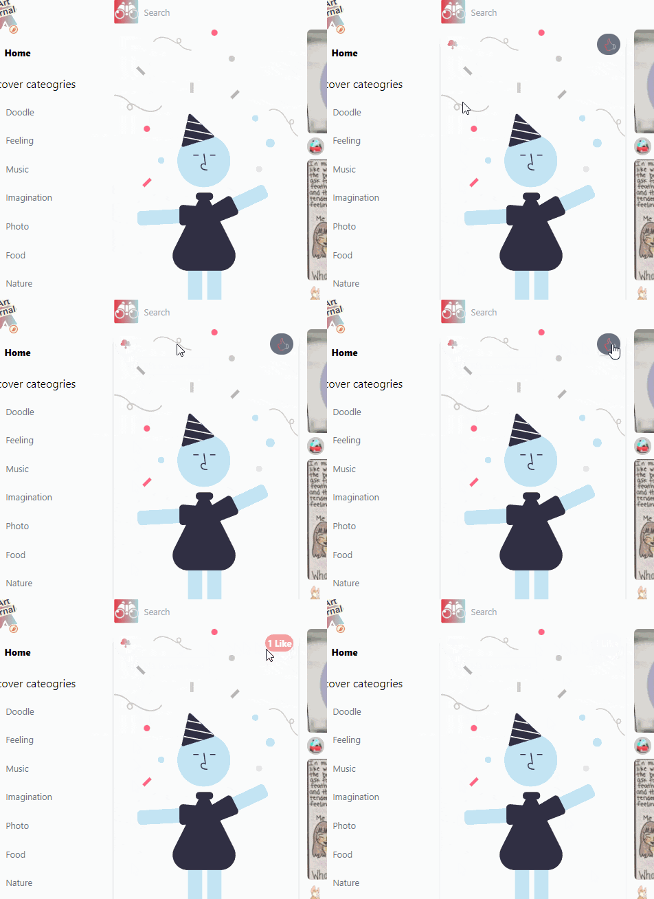
More Detail in Art Component
Build <MasonryLayout/>📱component
- Create a new
MausonryLayout.jsxfile insidecomponentsfolder - In the terminal, run
npm i react-masonry-css. This is an awesome CSS tool to render images with different dimensions. It is a React Component with simple interface to organize items into the desired columns at specified breakpoints. Import
Masonryfrom react-masonry-cssImport
<Art/>componentSet up
breakpointColumnsObjfollow this 👉 MasonryCSS Responsive Guide.- This components will receive
Artsprops from fetched Sanity JSON. - This is what the codes look like
import React from 'react';
import Masonry from 'react-masonry-css';
import Art from './Art';

const breakpointColumnsObj = {
     default: 4,
     3000: 6,
     2000: 5,
     1200: 3,
     1000: 2,
     500: 1,
};
// Fetched data from Sanity ⬇⬇
const MasonryLayout = ({ arts }) => (
  <Masonry className="flex animate-slide-fwd" breakpointCols={breakpointColumnsObj}>
    {arts?.map((art) => <Art key={art._id} art={art} className="w-max" />)}
  </Masonry>
);

export default MasonryLayout;
Build <Feed /> 🔭component
This component will fetch data from Sanity with queries (pre-defined in /utils/data.js) and the returned JSON is fed to the Arts display
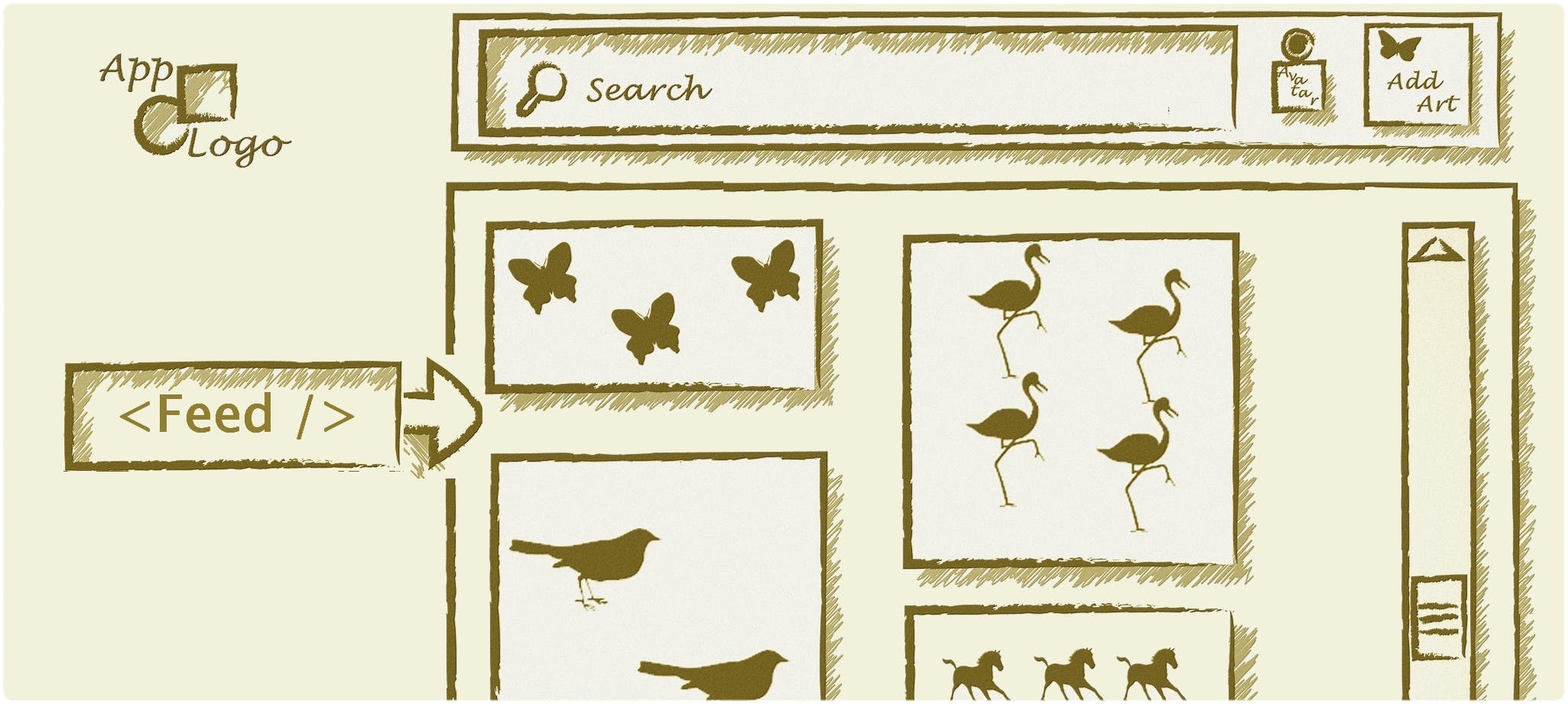
- Create a new
Feed.jsxfile insidecomponentsfolder - Import
{ useState, useEffect, useContext }hooks from React. - Import
{ allArtsQuery, searchQuery }that were defined in/utiils/data.js - Import
{ client }fromclient.jsx - Import
MasonryLayoutthat created above. - Import related svg
Iconsfromassets - To get the parameter from current Route (page's url), import
{ useParams }hook from react-router-dom - Set state for
ArtsandLoading(Fetching is always asynchronous ⏳. When it is loading, a spinner is rendered!)
if (loading) {
    return (
      <Spinner message={`...loading art works`} />
    );
}
- Create
fetchArtsfunction which takes one parameter:queryName.
const fetchArts = async(queryName) => {
    setLoading(true);
    const data = await client.fetch(queryName);
    setArts(data);
    setLoading(false);
  }
- Create a useEffect to fire up the fetch when parameter change
 useEffect(async () => {
    let cancelAsync = false;

    if (cancelAsync) return;

    // Fetch allArt or by Categories ⬇
    (!categoryId) ? fetchArts(allArtsQuery) : fetchArts(categoryQuery)

    // ⬇ clean-up function
    return () => {
      cancelAsync = true;
    }

  }, [categoryId, triggerRender]);
- In the return body, new state of
Artsis passed to<MasonryLayout />component to render an orderly images grid
  return (
    <div>
      {arts && (
        <MasonryLayout arts={arts} />
      )}
    </div>
  );
More Detail in Feed Component
Build <ArtDetail/> 🖼 component
This component renders a large image and display all details related to the specific Art (e.g., Comments, User's data, Art description, PostedBy) .User can add comment in this view.
- Create a new
ArtDetail.jsxfile insidecomponentsfolder - Similar to the process of building components above, at the top of
Artdetail.jsx, import{ useEffect, useState },{ Link, useParams },{ client, urlFor },MasonryLayout. - Import { artDetailMoreArtQuery, artDetailQuery } from '
./utils/data. These are two pre-defined queries for fetching art's detail from Sanity. - De-structure
{artId}from theuseParamshook.
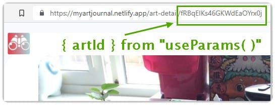
- Apply useState for elements that used in this components
const ArtDetail = ({ user }) => {
  const { artId } = useParams();
  const [arts, setArts] = useState();
  const [artDetail, setArtDetail] = useState();
  const [comment, setComment] = useState('');
  const [addingComment, setAddingComment] = useState(false);
- Create a
fetchArtDetailsfunction to dynamically updatequery stringwith{artIdand a callback function setArtWithQuery to fetch all detail.
// callback to be invoked in below try-catch
  const setArtWithQuery = async (queries) => {
    const artQuery = artDetailMoreArtQuery(queries);
    try {
      let result = await client.fetch(artQuery);
      setArts(result);
    } catch (error) {
      console.log("error in etArtWithQuery", error);
    }
  };
  const fetchArtDetails =async () => {
    const query = artDetailQuery(artId);
    if (query) {
      try {
        let data = await client.fetch(`${query}`);
        console.log(data[0]);
        setArtDetail(data[0]);
        if (data[0]) {
          setArtWithQuery(data[0]);
        }
      } catch (error) {
        console.log("error fetchingQUERY", error);
      }
    }
  };
- Create
useEffectto callfetchArtDetailswhen{artId}changes.
 useEffect(() => {
    fetchArtDetails();
  }, [artId]);
Create
addCommentfunction to add/update user comment to Sanity. Reference for this complex syntax can be found here 👉Patch/update a documentUse
Async...await...in conjuction withtry...catch...block to handle this asynchronous task
const addComment = async () => {
    if (comment) {
      try {
        setAddingComment(true);
        await client
          .patch(artId)
          .setIfMissing({ comments: [] })
          .insert('after', 'comments[-1]', [{ comment, _key: uuidv4(), postedBy: { _type: 'postedBy', _ref: user.id } }])
          .commit();
        fetchArtDetails();
        setComment('');
        setAddingComment(false);
      } catch (error) {
        console.log("error addComment", error);
      }
    }
  };
- In the return body, art picture is rendered with larger size and detail section for
Title,About(description when creating art). Commentsarray from fetchedart detailis rendered byarray.map( )methods- The
new commentinput field is built with html<textarea>tag whose dimensions are user-adjustable.
<img
   className="rounded-t-3xl rounded-b-lg max-h-xl"
   src={(artDetail?.image && artDetail.image.asset.url)}
   alt="user-post "
/>
...
<div>
   <h1 className="text-4xl font-bold break-words mt-3">
        {artDetail.title}
   </h1>
   <p className="mt-3">{artDetail.about}</p>
</div>
<Link to={`/user-profile/${artDetail?.postedBy._id}`} className="inline-flex gap-2 mt-5 items-center bg-white rounded-lg ">
  Posted by: <img
               src={artDetail?.postedBy.image}
               className="w-10 h-10 rounded-full"
               alt="user-profile-POSTEDBY"
               />
  <p className="font-bold"> {artDetail?.postedBy.userName}</p>
</Link>
<h2 className="mt-5 text-2xl">Comments</h2>
// Map the comments array ⬇
<div className="max-h-370 overflow-y-auto">
   {artDetail?.comments?.map((item) => (
              <div className="flex gap-2 mt-5 items-center bg-white rounded-lg" key={item.comment}>
                <img
                  src={item.postedBy?.image}
                  className="w-10 h-10 rounded-full cursor-pointer"
                  alt="user-profile"
                />
                <div className="flex flex-col">
                  <p className="font-bold">{item.postedBy?.userName}</p>
                  <p>{item.comment}</p>
                </div>
              </div>
   ))}
</div>
More Detail in ArtDetail
Build <Search/> 🔎 component
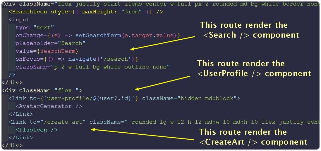
This component is rendered when searching arts base on the Categories or keywords. SearchTerm is passed from parent component, the <NavBar /> which is a simple component that has only three routing elements:⬇. Codes for NavBar
- Create a new
Search.jsxfile insidecomponentsfolder - Similar to the process of building components above, at the top of the file, import
{ useEffect, useState },{ client },MasonryLayout. - Import
{ allArtsQuery, searchQuery }fromutils/data.js - Create
useEffectto callclient.fetch( )withsearchTerm queryorallArtsQuery(when nosearchTermis provided)
 useEffect(async () => {
    if (searchTerm !== '') {
      try {
        setLoading(true);
        // from utils/data.js ⬇
        const query = searchQuery(searchTerm.toLowerCase());
        let data = await client.fetch(query);
        setArts(data);
        setLoading(false);
      } catch (error) {
        console.error(error)
      }
    } else {
      let data = await client.fetch(allArtsQuery)
      setArts(data);
      setLoading(false);
    }
  }, [searchTerm]);
- In the return body, when
Artscontain valid objects,<MasonryLayout/>is rendered . If not, render amessageinside adivtag
 return (
    <div>
      {loading && <Spinner message="Searching artworks" />}
      {arts?.length !== 0 && <MasonryLayout arts={arts} />}
      {arts?.length === 0 && searchTerm !== '' && !loading && (
        <div className="mt-10 text-center text-xl ">No arts found, do you wanna add one?</div>
      )}
    </div>
  );
Build <SideBar/> 🗄 component
This component will render the Categories array in utils/data.js and map each item into a <NavLink> that user can navigate to the specific Category view.
It takes the {closeToggle} prop from the parent <Home/> component to toggle CSS classes for responsive view. Please check out classes usage and breakpoint variant in this WindiCSS doc
- Create a new
SideBar.jsxfile insidecomponentsfolder - Similar to the process of building components above, at the top of
SideBar.jsx, import{ useState }from React,{ Link, NavLink}fromreact-router-dom. - Import
{ categories }fromutils/data.js - To toggle between active and inactive for each
Category, create twostringtypeconstantsthat contain CSS classes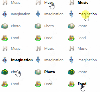
const isNotActiveStyle = 'flex items-center px-5 gap-3 text-gray-500 hover:text-black transition-all duration-200 ease-in-out capitalize';
const isActiveStyle = 'flex items-center px-5 gap-3 font-extrabold transition-all duration-200 ease-in-out capitalize';
- Create
handleCloseSidebarfunction to toggle betweenhideandshowconst handleCloseSidebar = () => { if (closeToggle) closeToggle(false); }; - Use
array.mapmethod to render a<NavLink/> for eachCategory`.<NavLink to={`/category/${category.name}`} className={({ isActive }) => (isActive ? isActiveStyle : isNotActiveStyle)} onClick={handleCloseSidebar} key={category.name} > <img src={category.image} className="w-8 h-8 rounded-full shadow-sm" /> {category.name} </NavLink> - Import
{user}object from AppContext - Create a button-like
<Link />for routing the page to<UserProfile />
...
const { user } = useContext(AppContext);
...
{user && (
  <Link
     to={`user-profile/${user.id}`}
     className="flex my-5 mb-3 gap-2 p-1 items-center bg-gradient-to-r from-green-400 to-blue-500 hover:from-pink-500 hover:to-yellow-500 rounded-lg shadow-lg mx-3"
     onClick={handleCloseSidebar}
   >
     <AvatarGenerator />
     <p>{user?.user_metadata.full_name}</p>
     <RightArrow style={{ maxHeight: "1.75rem" }} />
  </Link>
)}
More Detail in SideBar
Build <UserProfile/> 👩💻 component
This component is rendered when the App is routed to path="/user-profile/:userId"
- Create a new
UserProfile.jsxfile insidecomponentsfolder - Similar to the process of building components above, at the top of
UserProfile.jsx, import{ useEffect, useState}from React,<MasonryLayout />component,{ useParams, useNavigate }fromreact-router-dom. - Import
{ userCreatedArtsQuery, userSavedArtsQuery }from../utils/data. These are two pre-defined quries for fetching arts that user created and liked. - Import related svg
Iconsfromassets. De-structure
{userId}from theuseParams( )hook.To toggle between Created Arts and Liked Arts
button, create twostringtypeconstantsthat contain CSS classesconst activeBtnStyles = 'bg-yellow-600 text-white font-bold p-2 rounded-xl w-20 outline-none'; const notActiveBtnStyles = 'bg-primary mr-4 text-indigo-900 font-bold p-2 rounded-xl w-20 outline-none';Set state variables:
const { user, logout } = useContext(AppContext)
const [arts, setArts] = useState();
const [text, setText] = useState('Created');
const [activeBtn, setActiveBtn] = useState('created');
const navigate = useNavigate();
const { userId } = useParams();
const [loading, setLoading] = useState(false);
Create a
useEffectto call the asynchronousclient.fetch(queyName)useEffect(async () => { try { if (text === 'Created') { const createdArtsQuery = userCreatedArtsQuery(userId); setLoading(true); let data = await client.fetch(createdArtsQuery); setArts(data); setLoading(false); } else { const savedArtsQuery = userSavedArtsQuery(userId); let data = await client.fetch(savedArtsQuery); setArts(data); } } catch (error) { console.error(error) } }, [text, userId]);- Render
user detailwith abanner,avataranduser name<div className="flex flex-col justify-center items-center"> // Background banner ⬇ from Unsplash <img className=" w-full h-40 2xl:h-70 shadow-lg object-cover" src="https://source.unsplash.com/1600x900/?textures-patterns,art" alt="user-pic" /> <AvatarGenerator /> </div> <h1 className="font-bold text-3xl text-indigo-900 text-shadow-lg text-center mt-3"> {user.user_metadata.full_name} <h1> - Render an
Exit Iconfor loggin out user<div className="absolute top-0 z-1 right-0 p-2"> <ExitIcon onClick={() => { logout() navigate('/') }} className="px-1 py-1 border border-yellow-500 hover:cursor-pointer hover:bg-yellow-500 rounded-xl float-right" /> </div> - Render
CreatedandLikedbuttons with toggle classNames. These two buttons will set thetextthat controlsfetch queryin theuseEffect.<div className="text-center mb-7"> <button type="button" onClick={(e) => { setText(e.target.textContent); setActiveBtn('created'); }} className={`${activeBtn === 'created' ? activeBtnStyles : notActiveBtnStyles}`} > Created </button> <button type="button" onClick={(e) => { setText(e.target.textContent); setActiveBtn('liked'); }} className={`${activeBtn === 'liked' ? activeBtnStyles : notActiveBtnStyles}`} > liked </button> </div> Render the
fetched resultfromuseEffect<div className="px-2"> {loading && ( <Spinner message={`Loading ${user.user_metadata.full_name}'s art works`} /> )} <MasonryLayout arts={arts} /> </div> {arts?.length === 0 && ( <div className="flex justify-center font-bold items-center w-full text-1xl mt-2"> Nothing to show..yet ! </div> )} </div>
Deploy the App with Netlify
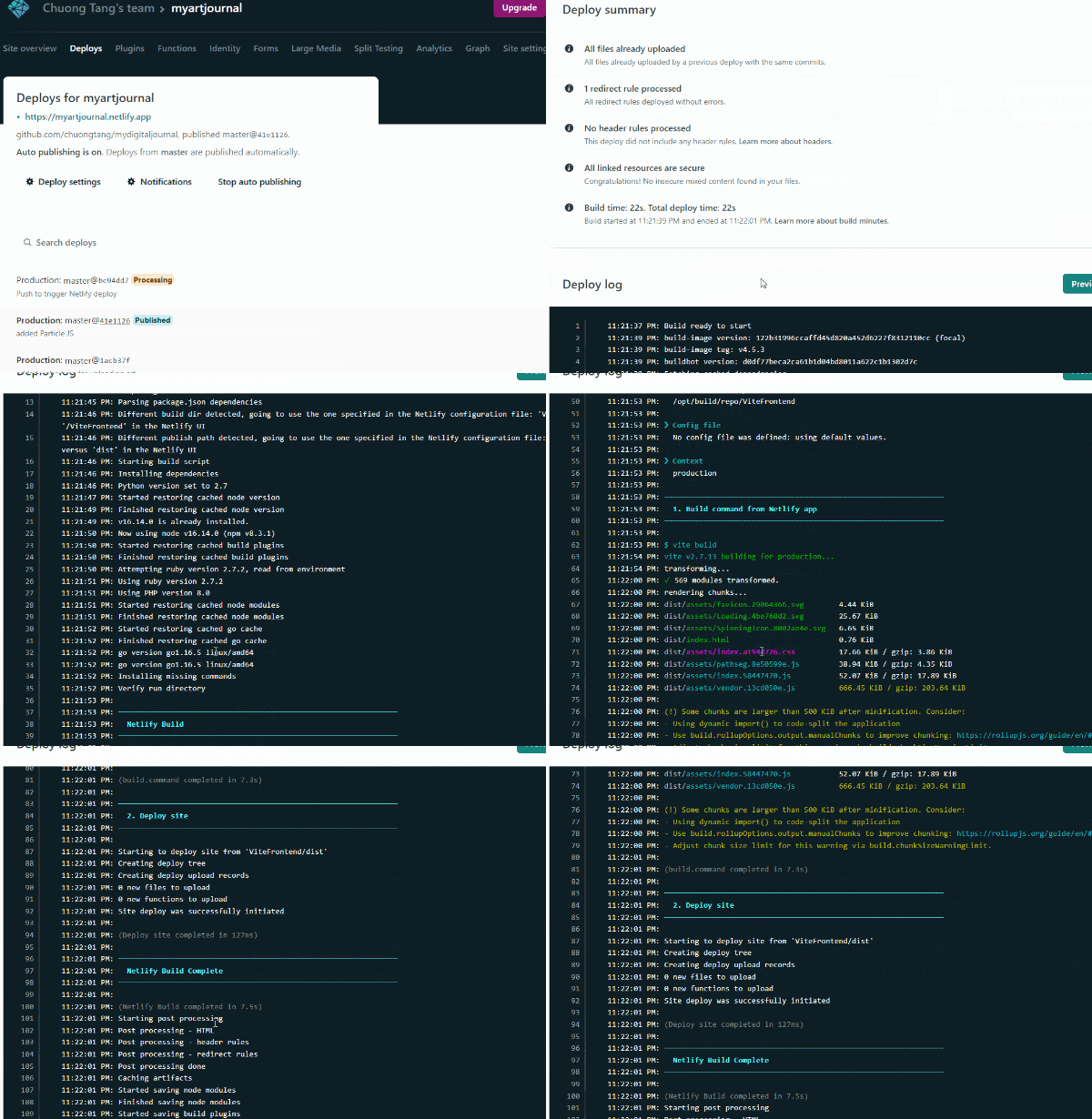
Netlify is a modern CI/CD infrastructure for frontend. It is pre-configured and fully automated that whenever codes get pushed to Github it trigger a deployment
- Since this app was deployed previously by connecting to Github repo, when merging branches , Netlify will run tests and deploy the updated version
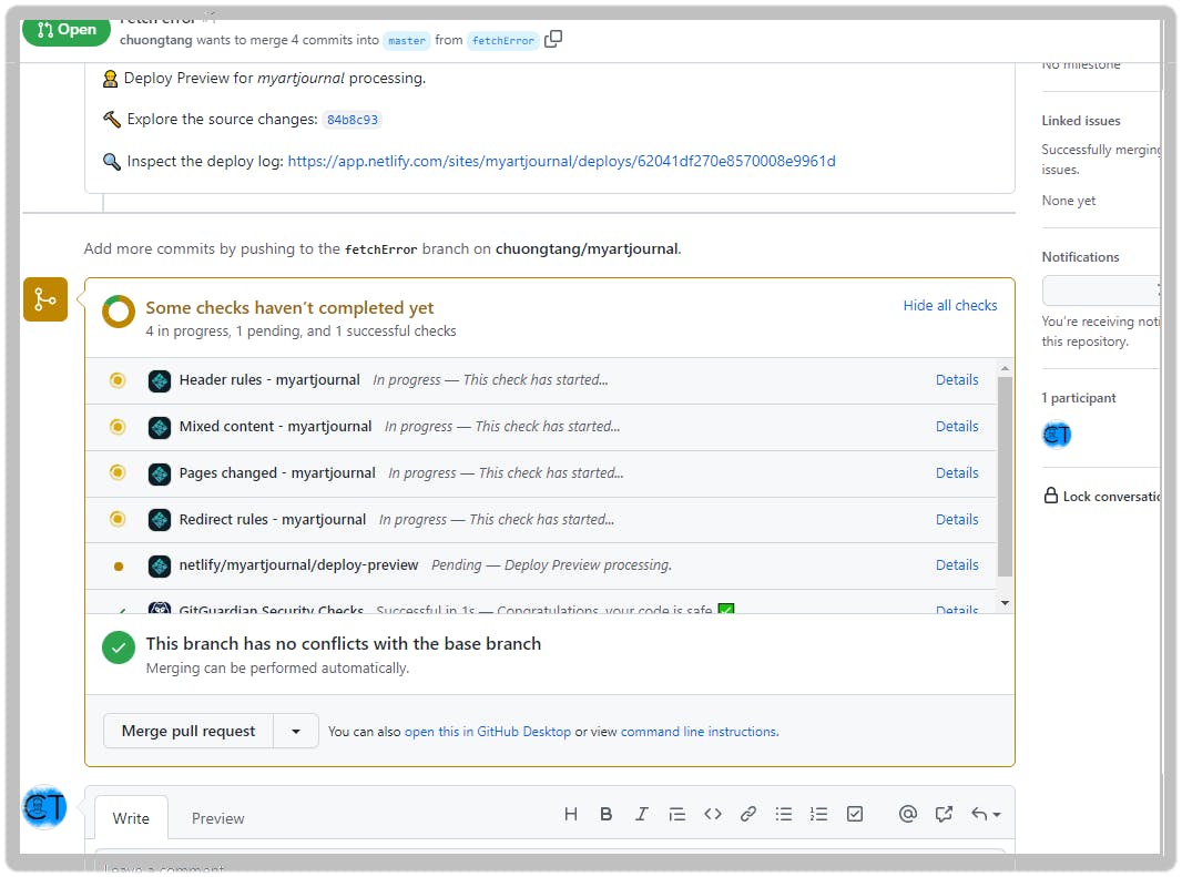
- When a new commit get pushed to the repo, Netlify automatically deploy the new update
UI upgrade
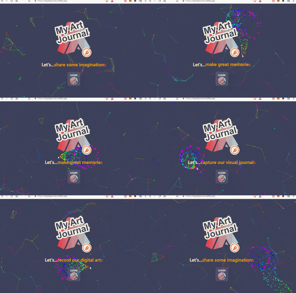
Add ParticleJS and React Text Transition in <AuthUser /> component for better visual effect
- In the frontend root, run
npm i react-tsparticles react-text-transition - Create a new file
ParticleBG.jsxinside thecomponentfolder. - Copy the
<Particles />from ParticleTS Code and paste it into thereturnofParticleBG.jsx - Back to the
AuthUser.jsx, import these two components
import TextTransition, { presets } from "react-text-transition";
import ParticleBG from './ParticleBG';
- Set a
constantfor array of strings
const TEXTS = [
  "capture our visual journal",
  "record our digital art",
  "share some imagination",
  "make great memorie"
];
- Create state variable for
Text IndexanduseEffectto call theIndex increase
const [index, setIndex] = useState(0);

  useEffect(() => {
    const intervalId = setInterval(() =>
      setIndex(index => index + 1),
      3000
    );

    return () => clearInterval(intervalId);
  }, []);
- In the return body , render these two components
    <div className="flex justify-start items-center flex-col h-screen ">
      {/*⇩ kids would love to play with this colorful thingy! */}
      <ParticleBG />
      <div className="relative w-full h-full ">
        <div className="absolute flex flex-col justify-center items-center top-0 right-0 left-0 bottom-0 bg-blackOverlay">
          <div className="p-5">
            <AppLogo size={250} />
          </div>
          <section className='mx-4 md:text-3xl lg:text-5xl font-600 text-shadow-sm  text-stroke-sm mb-8 flex'>
            <div style={{ color: "#E9E1B6" }}>Let's...</div>
           // ⬇ Animation start
            <TextTransition
              text={TEXTS[index % TEXTS.length]}
              springConfig={presets.wobbly}
              className='text-yellow-500 '
            /><span className='text-red-500'>s</span>
          </section>
          <div className="shadow-2xl ">
            <button type="button" className="py-2 px-4  bg-gray-500/50 hover:bg-indigo-700 focus:ring-indigo-500 focus:ring-offset-indigo-200 text-white w-full transition ease-in duration-200 font-semibold shadow-md focus:outline-none focus:ring-2 focus:ring-offset-2  rounded-lg " onClick={login}>
              LOGIN
              <LoginIcon />
            </button>
          </div>
          <div className="shadow-2xl">
          </div>
        </div>
      </div>
    </div>
- Commit then push to Github to trigger Netlify deployment
Try it out
Thank you very much for reading to the end of this post. I am sure there will be some missing points. I should have budgeted more time for writing this very first post 😩.
Your comments, feedbacks, either side of the spectrum, are highly appreciated. Learning journey never end for me. Thank-you!
Again thanks to @Netlify and @Hashnode for this amazing learning opportunity

